Wednesday, April 22, 2015

Illuminate


For one of my classes this semester, I had to write about what I consider good illustration and an example of an illustration that meets my criteria. I chose to write about one of my favorite illustrations of all time, the cover art for an album by one of my favorite bands. Below is an excerpt from my paper as well as my take on the piece that I did a few years ago. 


Illustration is visual storytelling. As is the case with art in general, it should be aesthetically pleasing. Most art is representational by nature, but the purpose of illustration is to convey a specific message. Nothing about illustration is random. An illustrator does not simply slap some paint onto a canvas: every brushstroke is calculated. A good illustration should be able to tell a story on its on, without relying on a written explanation. My criterion for a good illustration is a piece of art that effectively conveys a message in a visual style that supports and enhances the message.

My example of successful illustration is an album cover for a band called Lydia. The album is called Illuminate, and the cover artwork was illustrated by artist Becky Filip. Even without the context of listening to the album, the cover art visually tells a story which is what makes it a powerful illustration. This illustration features a faceless girl standing in the ocean. She is standing next to a tree and is she is holding an umbrella, both of which are blowing in the wind. Her hair, dress, and the waves she is standing in are also blowing in the wind, making it clear that she is in the midst of a storm.  Despite the fact that everything surrounding her is yielding to the wind, she herself is not. The artwork conveys a clear message of staying grounded and unmoved in the face of adversity. It communicates hope through the image of a small girl withstanding the storm. This message is in accordance with the title Illuminate, the symbol of the girl is a ray of light amidst the metaphorical darkness of the storm. The style that this piece is done in further strengthens the message of the illustration. Through a subdued color palette, Filip creates an ominous mood, yet the figure is a lighter color than the rest of the piece—playing on the theme of a light in the darkness. Filip also uses lines to show movement in the hair, the waves, the dress, and the tree. His technique is called hatching. The lack of hatching on the girl herself emphasizes that she is stationary, unlike her surroundings. Though the piece has a somewhat gloomy feel to it, it is also whimsical which makes it a good illustration for this album cover. The lyrical content of this album leans towards the darker side, yet the sound of the music is very ambient. After analyzing the artwork further, I was impressed with how well it captured the feeling that this album evoked in me. This is a very well executed illustration due to its ability to convey a message without words, and the way the artistic technique accentuates that message.


Friday, November 14, 2014

Digital Media Update #3

This was my midterm for my digital media class. I had to paint the portrait I did earlier in Photoshop.

This is another project I did recently. We were instructed to choose a coloring book image and add texture layers and paint the image in photoshop.

Figure Drawing Update #2

Here are a few of the drawings I've done in figure drawing since my last update. These poses were between 5 minutes and 20 minutes. The pencil I used for these didn't show up well in the pictures, so I had to make a levels adjustment in photoshop. The paper doesn't look that weird in real life.


Analysis of Form Update #2

These are the 2 projects I've done in analysis of form since my last update. The first was a drapery project and the second was a torso project. The torso was a cast that we had in class, not a live model. Both of these are 18x24 inches and were done in vine charcoal and charcoal pencils.


Sunday, October 19, 2014

College Update #4: Digital Media

The fourth class I'm taking this semester is digital media. It's a class about photography and Photoshop. These are some of the pictures I took for this class. Most of these are already on my flickr.


One of our projects was to take a picture based on the theme "darkness rising," and to practice using some of the different lighting techniques we learned about in class. I decided to go with a fallen angel theme. I took this picture in my dorm room and used my desk lamp for the lighting. 
For an in class assignment, we could do anything we wanted using photoshop techniques we learned that day. I decided to further edit a picture I made for a friend. I think it's safe to say that this is my favorite class. 
For another homework assignment, we had to clone ourselves. These are the two pictures I made. 

Our most recent assignment was to create a portrait of someone by making a collage out of pictures our professor gave us. I decided to use a picture of Buster from Arrested Development. This was extremely time consuming and by the time I was finished I had around 300 layers.


College Update #3: First Year Seminar for Illustrators

Another class I am taking this semester is a seminar for illustrators. My professors assign us 7 sketchbook pages every week based off of a certain topic they give us. These are a few of the ones I did for line quality. For these I just used microns and watercolor.


Below is a sketchbook I did for contrast and focal point. I used Vine charcoal, prismacolor markers and microns.
Our first big project for this class was to create a board game, and this is the box I made for mine. i learned a very important lesson from making this, which is never to use spray paint in your room.


College Update #2: Figure Drawing

Figure Drawing is the other studio drawing class I'm taking this semester. It's definitely one of my harder classes; drawing the human body is not easy. None of these drawings are particularly good, and the first 2, which are from my first day of class, are pretty laughable. But in retrospect, it's pretty encouraging to see the improvement I've made in only 6 weeks. All of these drawings are rough sketches because we only get 1-20 minutes for each pose. Our professor just wants us to focus on proportions and capturing the gesture of the model.


College Update #1: Analysis of Form

Analysis of form is one of two studio drawing classes I'm taking this semester. We only use charcoal in this class which was pretty challenging for me at first because it's not a medium I've used before.

For the first few weeks of class, we learned how to draw man-made objects, like bottles. To make drawings of man-made objects look realistic, it's important to have really straight lines. These drawings may not look like much but they take a pretty long time to do, because it takes a while to figure out the proportions of everything.
For extra credit, my professor told us we could start a perspective drawing. This is unfinished but it was interesting to practice using vanishing points.

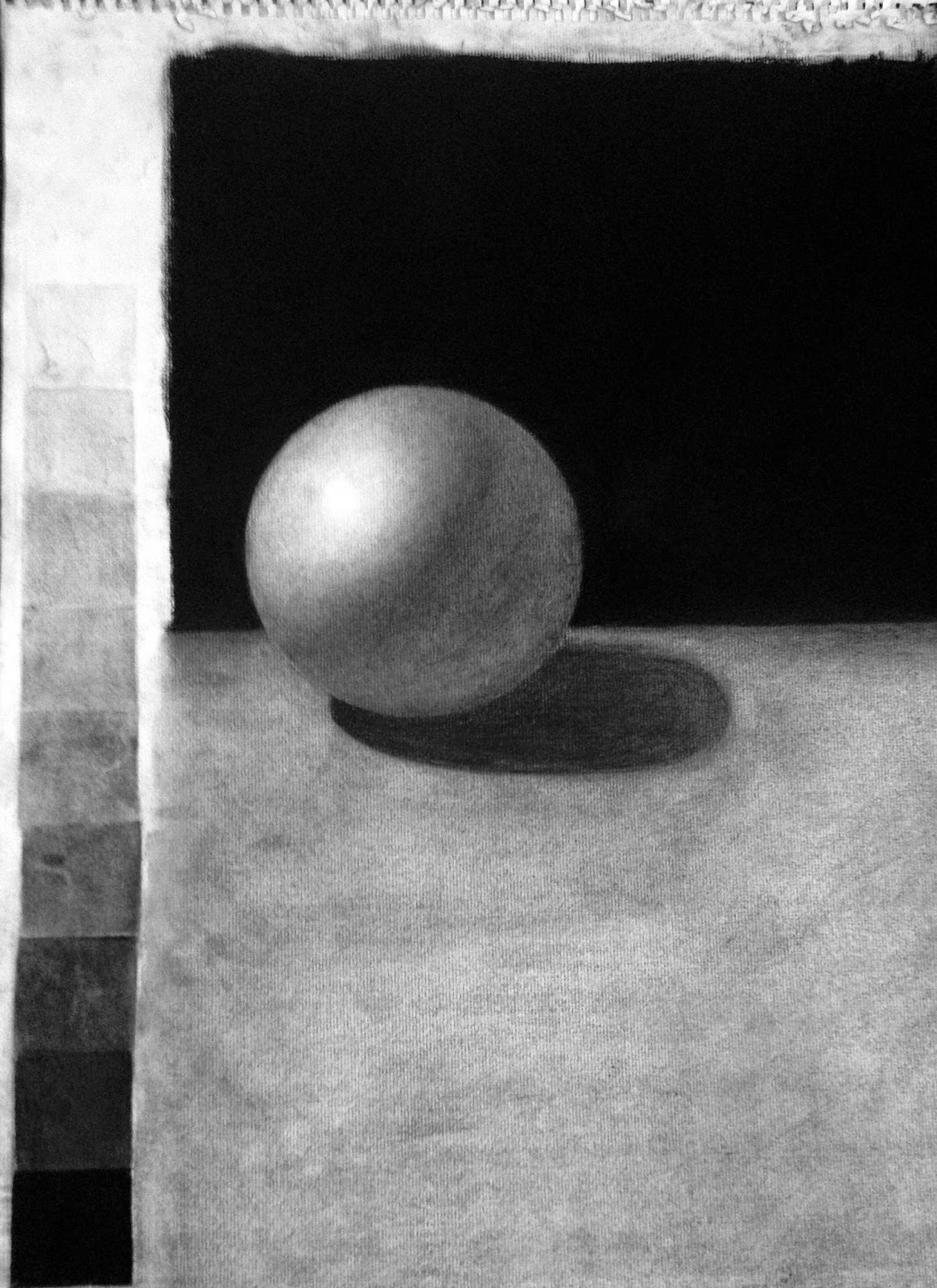
One of our first bigger homework assignments was to draw and render a sphere. The first picture is the first sphere I did. When everyone brought their spheres to class again, our professor told us they were all horrible and to redo them. The second sphere is the one I redid and as you can probably see, there's a huge difference. I didn't really want to post the first sphere but I think it's cool to see the improvement.
This is a cube I drew in class. Our professor said we could render it at home if we wanted so that we could get extra practice.
This was our first project. We had set ups in class of a still life and we had to draw and render the shapes. 


Sunday, May 25, 2014

Bird Collage Sketchbook


For this collage sketchbook, I painted my canvas with a variety of colors, and then glued tissue paper to it for texture. After that, I spraypainted leaf stencils onto the canvas and used a sponge dipped in acrylic paint to give the leaves some dimension. I then glued a picture that I drew of a bird in pencil onto the canvas, and painted a quote onto the canvas using acrylic paint.

Michael Cera Stencil Project


 For my first sketchbook of collage techniques, I made a stencil portrait of Michael Cera featuring a quote from the movie "Scott Pilgrim vs. The World." For the background of this sketchbook, I put torn pieces of newspaper on a canvas using glue, and then painted the canvas with a light blue wash. I next cut out my Michael Cera stencil and spraypainted it on my canvas with a red and yellow gradient. After that, I drew on my quote and went over the pencil markings with acrylic paint. I drybrushed black acrylic paint onto the background of the canvas, and in the stencil to make it look more three dimensional.

Monday, March 24, 2014

Multimedia Project


This is my multimedia project. The background is an abstract painting of shapes done in acrylic. I painted a spraypaint can and a wasp on watercolor paper using acrylic paint also. After I had finished painting the spraypaint can and the wasp, I cut them out and glued them onto my canvas. Finally, I made a stencil that says "XLIN" and spraypainted it on the top of my canvas. This was my first multimedia project and I enjoyed it because it was fun to use a variety of techniques in one painting.